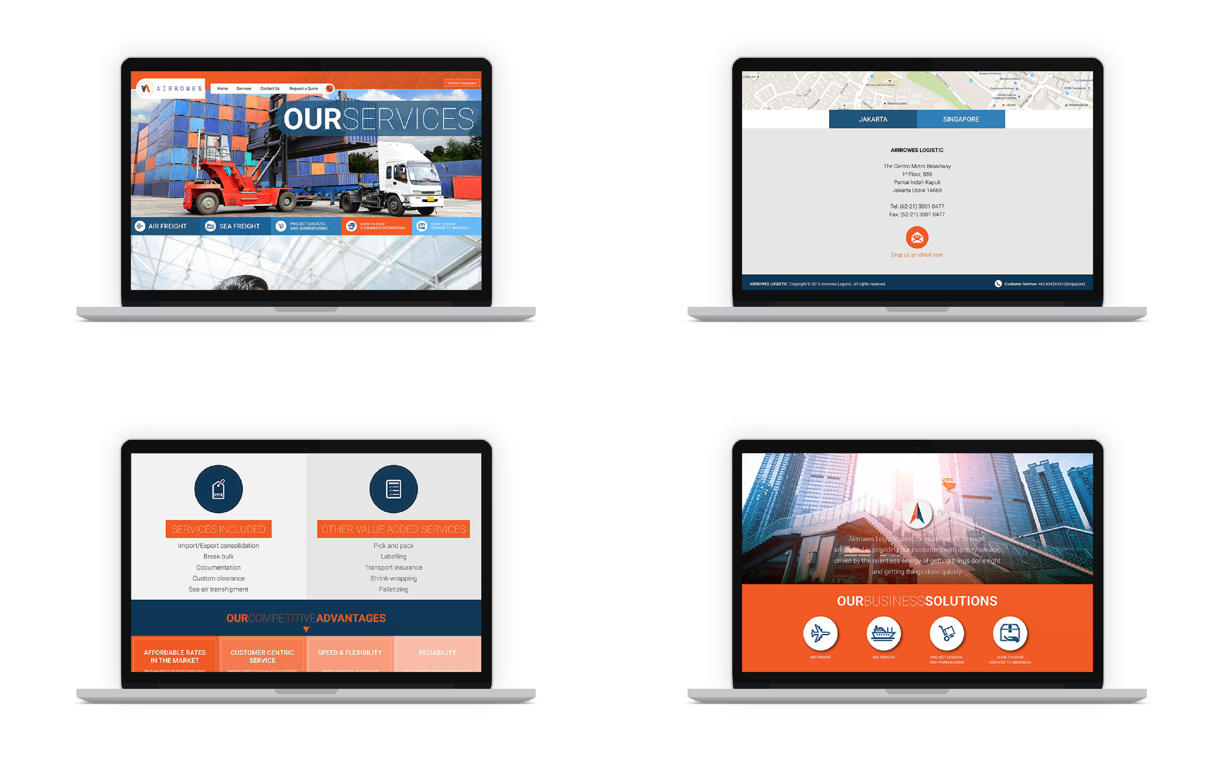
Airrowes Logistics has managed to build an exceptional reputation for quality service, customer satisfaction, and operational excellence in getting the job done right in a timely manner. Airrowes Logistic aims to maximize its strength and speed in providing our customers with quality service, driven by the relentless energy of getting things done right and quickly.


NEXT designed the branding, stationery and the digital development through the website. The logo is designed to show Airrowes as an integrated logistics company that will always aim high to give the best services for the clients. We started by using 3 basic elements, which are initial A, plane (for freight), and box (for logistic).

Based on these three basic elements, then we developed it into some alternative logos and colors. The logo was created with simplistic design and 2-3 colors that gave the impression of modern and sophistication without reducing the element of professionalism.


The website was created based on the customization of the logo which had been created by using two colors; orange and blue. Although Airrowes is a logistic company with corporate feels and boring, but Next Team created a website design that is modern and forward with excellent UI and UX.

The following is an application design for stationery. This design was made with the same color to match with website design and logo, but did not give the impression of boring as graphic elements on the stationery were made uniquely and has a deep meaning.